OK now I think I have your attention. In general I think I want to make two points.
- This pandemic has shown a massive downside of mass literacy. Everyone has access to everyone else’s bullshit (including mine). It’s unrealistic to fact check everything that gets reported. I’m not talking about antivaxxers necessarily, I’m talking about mainstream media struggling to understand their own articles.
- The fragmentation in the EU has done a fair amount of damage. Data is hardly comparable, as are policies since “hard lockdown” means very different things in Madrid and in Munich. Local governments ended up raising their local COVID-19 experts turned camera-happy shamans to demigod status, making self-proclaimed epidemiologists and mediocre local politicians the mainstream media equivalent of TikTok celebrities. Nobody has got any wiser.
It might sound like a digression, but it’s not unrelated to the point I’m making in the title, which, by the way, is true. We’ll get to it in a few minutes.
How do we look at COVID-19 casualties?
Plenty of people have been monitoring a plethora of websites, and proficiency in debating exponential growth is in everyone’s CVs. Sharing seemingly clever “this is why everyone else is wrong but I’m not” posts on all every social network, including LinkedIn, is now the hip thing to do.
Deaths datasets are more or less homogeneous, which means that at the very least the sources are the same everywhere. There are good news and bad news to this.
- The good news is that at the very least we don’t have people bragging about “having access to other non-mainstream data”.
- The bad news is that since no other data is available, we need to make guesses ourselves on what’s going on when we have inconsistencies. This leads to conspiracy theories or simply seeing inconsistencies that aren’t inconsistencies at all— e.g. “why is Germany’s death rate much lower than Italy’s?”: it’s not an inconsistency, it’s reality.
In short: we can see the data that national health departments provide, but we don’t have access to the exact criteria they use to attribute COVID-19 deaths. Even if we had access to it, in order to compare deaths across countries we’d need to do some cryptic simulation to, for instance, “estimate how many deaths country X would have on a given date if instead of counting people ‘dead due to COVID-19-related causes’ we counted ‘deceased people who happened to be COVID-19-positive’”.
Sounds confusing, right? Let’s look elsewhere.
Hello national statistics institutes
You might see where this is going.
I only looked at Spain, Italy, France and Germany. Here’s a small review of what their data looks like.
- Spain has very nice-looking data sets. It is a bit hilarious that even the JSON dataset is in Spanish, but if you want to parse their shit, it’s the best of the bunch. On the data itself if you’re too lazy to click a few links: they publish weekly deceased data since the year 2000. The more recent data is marked as “estimated” or “provisional”. No idea what the exact criterion for this distinction versus “definitive” (i.e. data until 2019) is.
- Italy, the fallen empire. The national stats institute doesn’t have the best looking website (Spain’s is also bad), but the datasets are slower to update than most. The good thing is that it’s very fine-grained and, in theory, unlike Spain, data is “official” for the time slot it’s reported. They also provide yearly summary tables for the period in question, i.e. Jan (or March?) to Sep 2020 compared to the Jan to Sep average of the past four years. This is a robust estimate for Italy, but we’ll see it might not be true in general.
- France’s biggest surprise is that they have an English version of their website, which is almost criminal. Of course with a few clicks you’re quickly led to untranslated stuff but it’s definitely better than everyone else. They publish monthly data since 1994, one month ahead of Italy but slightly less up to date than the others. You can download an easily manageable CSV, not as good as Spain’s JSON of doom but we can’t always have what we want from life.
- Last but not least, the fourth Reich. Again, can’t be bothered to browse the website all over, but I’m not sure everything is available in English, so German will have to do. Germany’s statistics institute is ready for this sort of thing so they have nice reports and infographics explaining COVID-19’s impact to the rest of the world, made by people who know what they’re talking about. I haven’t been following real life media in Germany these days, or any media really, but it wouldn’t surprise me to see that they’re best in class on this. The other three countries’ stats experts should take a lot of pages from Germany’s books, if, of course, we’re nice enough to concede that they should still have a job in that institute after that comparison. But enough with the good stuff: the actual data set is a bit annoying to parse, and data is only available since 2015. We’ll see why this doesn’t matter.
I like how whenever we make lists the content tends to grow. I wonder why.
The actual data
The plots and the data reports aren’t the best, it’s not worth cleaning stuff up for a Medium post — or, if you work in the Italian institute of statistics, ever.
Italy
As I mentioned earlier, Italy has a massive fine-grained dataset for the past five years. As we know the population is quite old and not growing, which means that deceased figures are more or less stable.
The raw data set is a piece of shit. Either one decides to waste an insane amount of time on it — you really shouldn’t — or be smart and get what you want to know from the raw one and then use the summary Excel file. What one should get out of it is that the deceased figure is relatively stable (~645±12k on average, going up and down over the years), and of course, that this data is not IID: the latest deceased figures will be better estimators for this year’s. Keep this in mind if you want to do confidence intervals.
Once that is established, we can look at the aggregated Excel file which compares this year’s data, March to September, with the average of the same period in the previous five years. The difference is roughly 50k. Keeping in mind that the data is until September, i.e. excluding the latest figures which are much higher than that, you can grab your favourite COVID-19 tracker data and look at the cumulated sum until the 30th of September and you’ll notice that the difference is almost spot on.
Sure: it might be chance, and there might be some difference we’re not seeing, but let’s hold on to our data dearly, because we’ll see there’s more fun stuff coming.
Germany
Germany’s dataset is not even worth analysing, and one could tell easily from the summary they show in the homepage linked above. COVID-19 seems not to have had a noticeable effect in the casualty stats.

It was apparent to many that Germany was handling the pandemic better than others, no idea if the handling itself is better or not, or if people are less likely to die once they’re hospitalised, and so on, but hey, you have the data, make up your own conjectures.
Oh, and before I forget, many people were living in denial, theorising that Germany was miscounting COVID-19 deaths since the toll was so low. This is not true, or at least, if it is true, the effect of this “rigging” is minimal.
France
France is a textbook case of why maybe the very last data point is the best predictor for this year’s data, for all of you stats nerds.
As above, data is available until the full month of October for 2020, so we need to restrict the other years’ data to the same range.
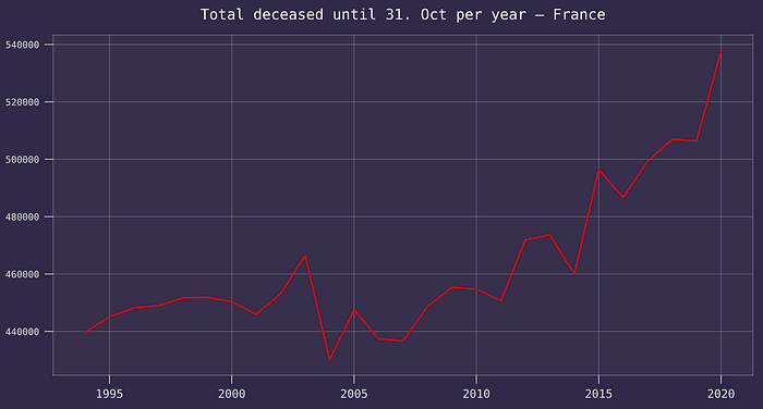
There is some variability here but as we can see even if we look at the average of 2017–2019 we’re talking about 5k at best. Just like in Italy’s case, the 35k difference looks as if it was extracted with a very boring calculator from the cumulative COVID-19 deaths for France in the same time period.
We could argue that “it might be that the casualties were on a downward trend but it’s been offset by COVID, and COVID deaths are actually higher”. This is possible, and it’s yet another reason why it’s meaningful to look at all of these datasets.
Spain
The grand finale. I know I said I liked Spain’s JSON but downloading it and parsing it in Python takes a long time. In my defence, it doesn’t seem to be possible to filter it, as it does have a fair amount of unnecessary derivative data.
Anyway, after you manage you realise that the dataset is weekly, so you need to filter until week 49, i.e. ending on the 6th December this year. The uncertainty due to the position of the week doesn’t seem to matter a lot when one considers the variability — I know, we could do more precise calculations, but let’s look at the results instead.
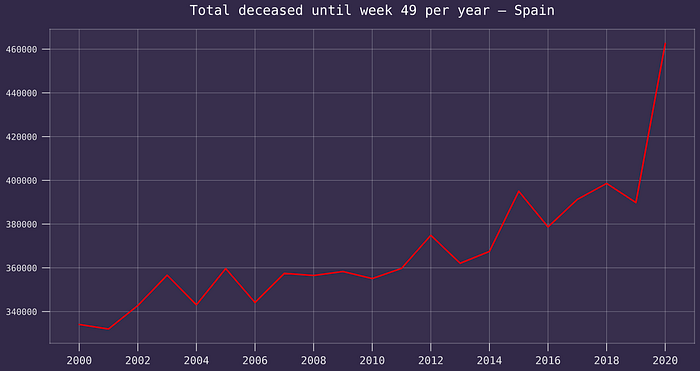
Spain counted 47k deceased until the 6th December. Looking above and coming up with whichever estimates, we realise that the actual value is somewhere around 70k. Unless we have reason to believe that more people died of other causes, the reported figure isn’t reliable.
What do we make out of this?
Spain isn’t rigging the data on purpose. There is no point in shaving a 30% off a very high number of deceased. There is no conspiracy with politicians hunting for votes on this, and nobody is pretending COVID isn’t there to justify keeping stuff open, and so on — Spain does have severe restrictions at the time of this writing.
A couple of conclusions.
- If this doesn’t call for harmonisation of demographic data, I don’t know what does. Not only are the dead calculated differently, but we have statistics institutes which employ a reasonable amount of people not talking to each other and not copying “good practices” from each other. Just like we have our health shamans, we also have our stats shamans.
- You can be sceptical about my thesis. There are a few possible counterarguments that I’ve exposed. The fact is, what I presented here is based on very very simple assumptions, and the conjectures aren’t unreasonable. Until we decide that standardising reporting procedures on a EU level is important, these sorts of approximate arguments (yours vs. mine) are all we have.
- The EU is a good peace-time structure. Don’t get me wrong, I like my passenger rights’ compensation, cancellation of roaming fees and so on. But if the foreign policy fuckups of the past 10 years should have been a sign of things to come, we haven’t been that smart when it came to handling this pandemic, even just from a monitoring perspective.
- Some countries have handled everything better than others. Many deaths were unavoidable, but in several places (Italy and Spain on top) there have been colossal mistakes and no admission of any of them. This is not part of the culture of those political classes and it should probably change. Italy in particular was quick at pointing out the King of Sweden’s speech on his own country’s fuckups. We have yet to see a similar speech in Italy or Spain.
The end.
